Where Nobel laureates were born — an interactive map
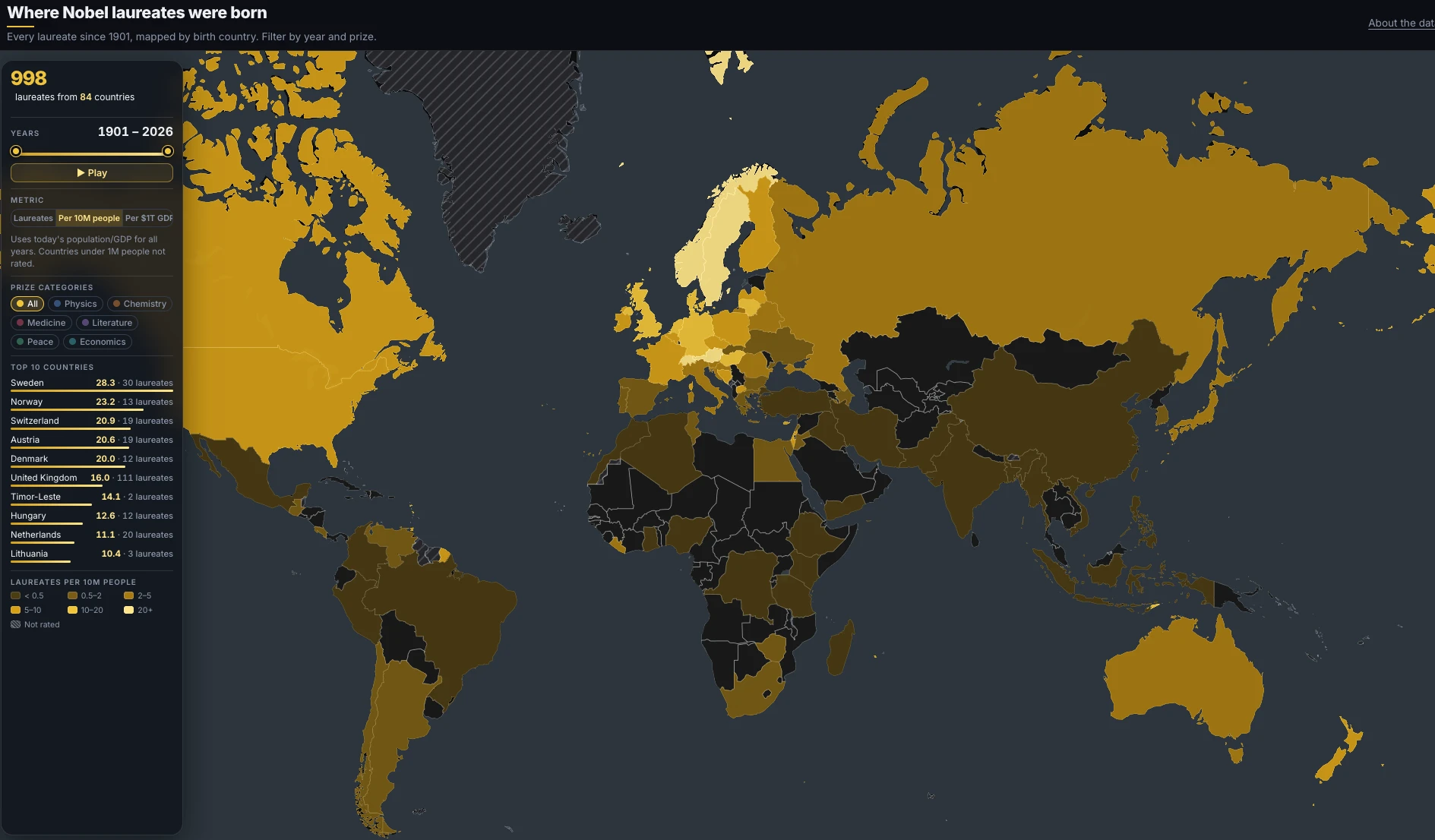
Every October the same ritual: the Nobel prizes are announced, the same handful of countries take a bow, and the same map appears in every newsroom — raw totals, United States on top, story over. I wanted a map that could answer better questions. When did Europe hand the lead to America? Which countries punch above their weight? Where were the physicists born, as opposed to the peace laureates?
So I built one. It pulls all 1,003 prizes awarded since 1901 from the official Nobel API and places each of the 998 laureates in the country where they were born, on today’s borders. There is a time slider you can drag or just press play on, a filter for each of the six prize categories — each with its own colour scheme — and a metric switch that is the real point of the whole thing. Click any country and you get its laureates, year by year, each linked to their Wikipedia page.
The metric switch is where the story flips. By raw count, the United States dominates: 298 laureates, with the United Kingdom second at 111. Switch to laureates per ten million people and the giants deflate — the US falls to fifteenth — while Sweden (28.3), Norway (23.2), Switzerland, Austria and Denmark take over the podium. Switch to laureates per trillion dollars of GDP and the map stops rewarding wealth entirely: suddenly it is Timor-Leste and Bosnia glowing, two Peace prizes against tiny economies. Three honest maps, three completely different headlines.
One honesty note, because everything else hangs on it: this is birthplace, not career. Marie Curie counts once, for Poland, although she won twice and worked in Paris. Borders are today’s — a laureate born in the Russian Empire in a town that is now Polish counts for Poland. The per-capita and per-GDP views divide 125 years of prizes by this year’s population and GDP, which is a simplification I chose deliberately and label on the map. And the 31 prizes awarded to organizations — the Red Cross, UNHCR — appear on no map at all, because institutions have no birthplace.
The birth-versus-career gap is its own story: roughly a third of laureates with a research affiliation won their prize in a different country from the one they were born in, and the United States is by far the biggest net importer. That deserves a post of its own — it is coming.
The whole thing is a static page — no backend, no tracking, just MapLibre, Natural Earth boundaries and one JSON file of laureates — so it loads fast and the code is small enough to read in one sitting.
→ Explore the map: https://milanjanosov.github.io/nobel-map/
Every view you set — years, category, metric, even a selected country — is carried in the URL. If you find an angle worth sharing, send me the link: I genuinely want to see which stories people dig out of it.
