Where the Heat Meets the People
Budapest in 702 Hexagons
In Forty Summers of Heat, I turned four decades of free Landsat thermal imagery into one surface-temperature map per summer for Budapest, and the headline was blunt: the city's summer surfaces run nearly six degrees hotter in the 2020s than they did in the 1990s. But a heat map answers only half of the question that matters. It tells you where it got hot. It says nothing about who is standing there.
This piece takes that one step further. I cut Budapest into 702 equal hexagons, using Uber’s standard H3 hexagon grid system, to measure how much each one warmed over twenty years, count how many people live in each one, and then overlay the two into a single heat exposure index — a map of where the warming and the people actually coincide. As it turns out, some of the places warming fastest are almost empty, and the places where the two curves cross are not the ones I would have guessed.
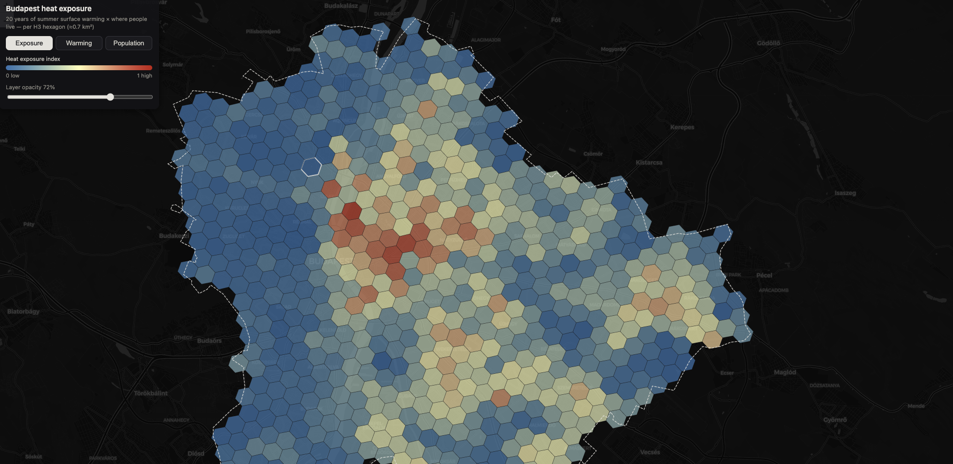
This agian, comes in an interactive map format as well as a YouTube walk-through and a complete Python tutorial.
hy hexagons
The raw warming map is a grid of 30-metre pixels, and at that scale it is noisy: one pixel is a roof, the next is the courtyard behind it. For a question about neighbourhoods, I want neighbourhood-sized units — big enough to average out the noise, small enough that "this is where you live" still means something, and identical in size so that comparing any two of them is fair.
That is exactly what Uber's H3 grid provides: a hierarchy of hexagons covering the planet, where every cell at a given resolution has essentially the same area. At resolution 8, each hexagon covers about 0.74 km² — a few city blocks — and Budapest's administrative boundary swallows 702 of them. Every number in this article lives on that grid.
Two ingredients get poured into it.
Warming. From the Landsat archive built in the previous article, I take the median summer surface temperature for 2004–2008 and for 2022–2026, subtract, and average the difference within each hexagon. Across the city the mean is +2.3 °C in twenty years — but the spread is enormous, from −2.6 °C to +8.8 °C.
People. For population I use the JRC's GHS-POP layer, which distributes census counts onto a 100-metre grid. One methodological detail is worth pausing on, because getting it wrong silently invents citizens: population is a count, not a measurement. When you reproject a temperature map you average; when you reproject a population map you must sum, otherwise people are created and destroyed by the resampling. Done right, the check is exact — 2,338,619 people around Budapest before reprojection, 2,338,619 after — and the 702 hexagons end up holding 1.86 million residents, from empty forest cells to a single hexagon near the city centre with 23,409 people in it.
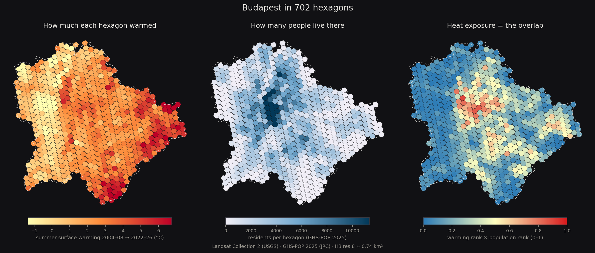
Figure 2. The same city three times: how much each hexagon warmed (left), how many people live in it (middle), and the exposure index that overlays the two (right).
Two maps that are near-opposites
Put the first two panels side by side and something jumps out: they are close to opposites. The deep reds of the warming map sit on the city's eastern and southern edge; the deep blues of the population map sit in the middle.
The numbers agree. The hexagon that warmed most in all of Budapest — +8.8 °C, in Rákoscsaba-Újtelep, out at the eastern edge — has 239 residents. The runners-up, at +8.0 and +7.9 °C in the same corner of the city, have twelve and twenty-six. The satellite only shows me the temperature, not the bulldozers, but the obvious suspect is the same land-cover story that produced the most extreme building-level warming in the previous article: fields and grass of the mid-2000s giving way to new construction. Meanwhile most of the dense core barely moves on the warming map, and the simplest explanation is an unglamorous one: streets that were already stone and asphalt in 2004 had little left to pave.
Across all 702 hexagons, warming and population are mildly anti-correlated. Weight the city's warming by where people actually live and the mean drops from +2.3 to +1.9 °C. If you stopped the analysis at the warming map, you would conclude the problem is on the periphery. That conclusion would be exactly wrong — and seeing why is the whole point of the third panel.
An index of overlap
The exposure index is deliberately simple. Within each hexagon I take the city-wide percentile rank of its warming and the percentile rank of its population, and multiply them:
exposure = warming rank × population rank
Ranks, because population is so heavy-tailed that one dense hexagon would otherwise flatten the entire scale. A product rather than an average, because the product is unforgiving: a hexagon scores high only if it is high on both. A baking but empty field edge scores near zero. So does a crowded but stable riverside block. The index runs from 0 to 1, and it only lights up where the two maps agree.
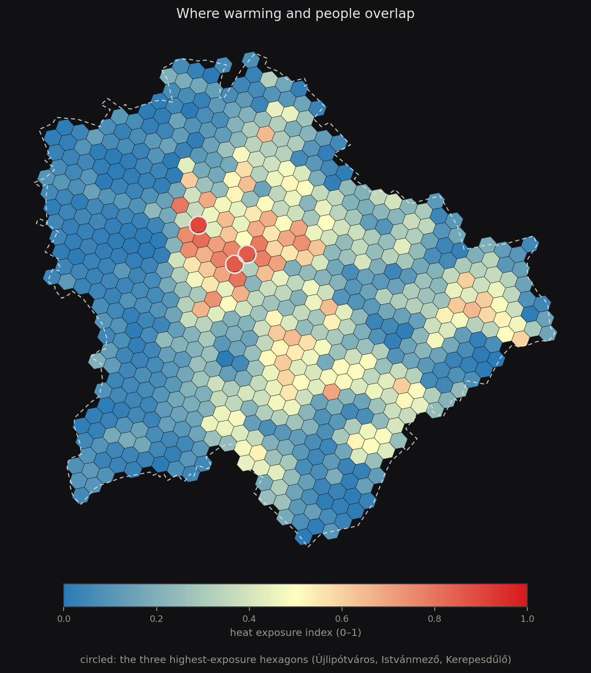
Figure 3. The heat exposure index. The fast-warming periphery and the dense-but-stable core both fade away; what remains is the band of inner Pest where the city is both crowded and warming fast.
What survives the multiplication is a band across inner Pest — and it is not where I would have pointed in advance. Ask anyone to name Budapest's heat traps and you get the postcard suspects: the tight courtyard blocks of the old downtown, the industrial stretch along the southern Danube. The index disagrees. The single highest-scoring hexagon in Budapest — 0.90 out of a theoretical 1 — is in Újlipótváros: 12,368 residents on 0.74 km², on surfaces that warmed +5.0 °C in twenty years. It is also the counterexample to the saturation story above — the core mostly stayed put, but not all of it did. Right behind it come the hexagons around Istvánmező and Kerepesdűlő — the belt of stadium grounds and former railway lands between Keleti and the Puskás Aréna, where large-scale rebuilding met an already dense neighbourhood — then Magdolnanegyed in Józsefváros, Újlak in Óbuda, and Törökőr in Zugló.

Figure 4. Down-town neighborhoods showing the highest level of heat increase exposure.
Add it up and the concentration is striking: just 43 of the 702 hexagons score above 0.6, yet they hold over 350,000 people — roughly one Budapest resident in five. And by raw warming alone, ignoring the index entirely: 403,000 residents — 22% of the city — live on surfaces that warmed by three degrees or more in twenty years.
And at the other end of the scale, one more thing I did not see coming: a handful of genuinely populated hexagons cooled. Krisztinaváros, Csillaghegy, Békásmegyer — each with thousands of residents — read one to two and a half degrees cooler than twenty years ago. At this resolution I can only see that, not why, but maturing tree canopy is the usual suspect, and it is an encouraging one: the surface record says cooling a lived-in neighbourhood is not hypothetical. It is already on the map.
What this map is, and what it is not
The same honesty rules as always, compressed. This is surface warming — the ground, the roofs, the asphalt — not air temperature, and not a medical heat-risk metric; a proper vulnerability map would weigh age, health and access to cooling, none of which a satellite sees. It is a relative index: 0.90 means "highest overlap in Budapest," not any absolute quantity. And GHS-POP models where people live — night-time, residential population — so the daytime exposure of office districts and transit hubs is understated. The map is a first cut at a question that deserves many more: not "how hot is the city?" but "for whom?"
Additionally, surface heat is just one of the many hazards today’s urban areas face - from extreme rainfall to draught.
